I redesigned this site in a day. The fonts took two.
Random
This site looked like a terminal for two months. Mono headings, a blinking cursor, a fake $ whoami above the page titles. I liked it when it shipped, then it started to feel like it’d gone a little overboard.
Too fancy.
So it’s gone. I always liked Scandinavian minimalism so I went back to it.
The new design is type, whitespace and hairline borders. One navy accent. Nothing animated except the reading progress bar.
The whole text face is one 30KB file, self hosted, so the page isn’t fetching anything from Google Fonts either.
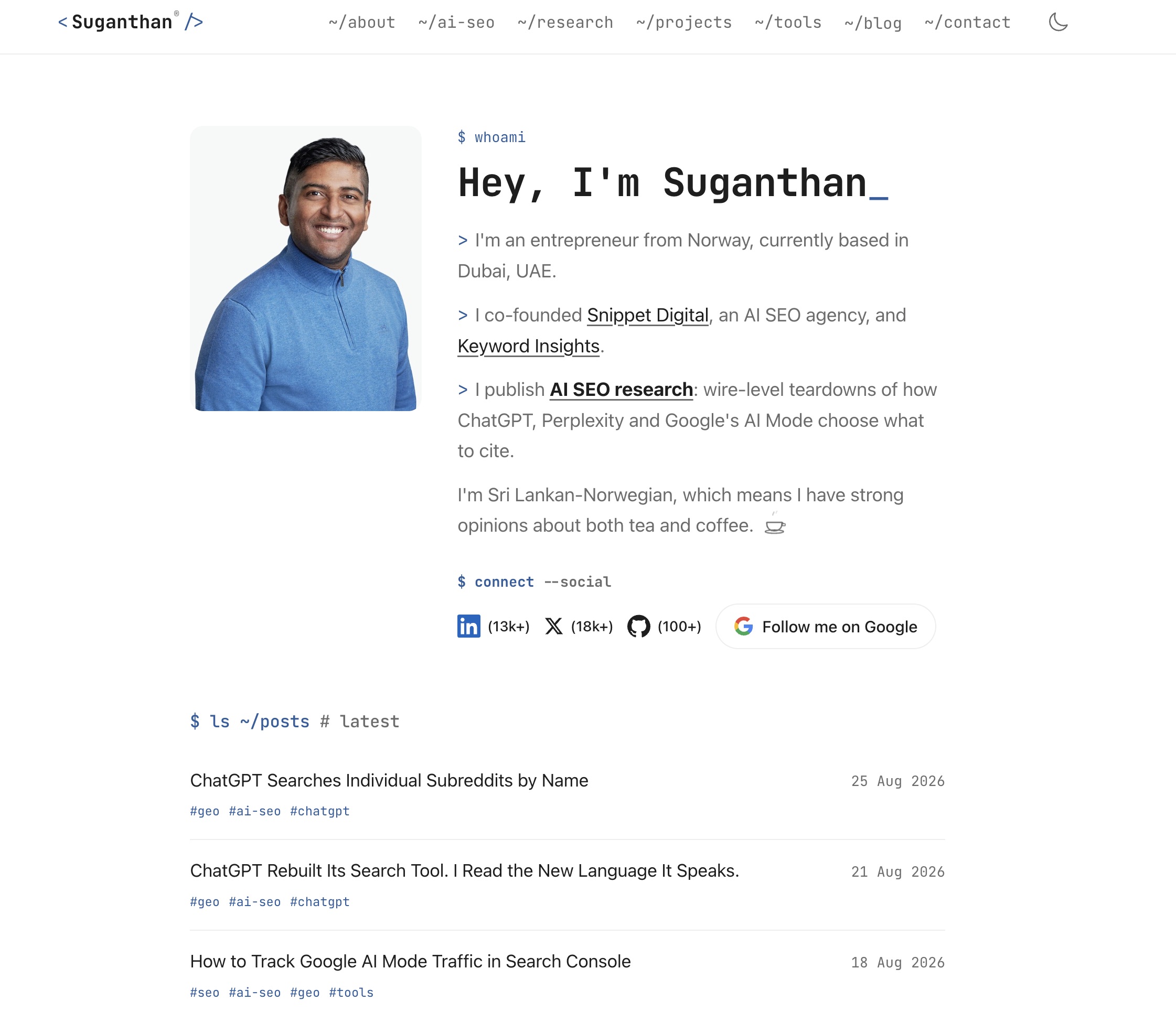
The mockups came out of Claude Design. I pointed it at the live site, told it what I wanted, and it returned a design for every page plus a handoff document for the rebuild.
Claude Code did the rebuild and the checking. Same URLs, same content, same schema, live in a day.
The fonts are where it got silly. The design specced Schibsted Grotesk, made by Bakken & Bæck for Schibsted, which looked great in the mockups and cramped on real posts.
I swapped it for Hanken Grotesk. Within a few hours I was squinting at a post on my phone, wondering if the text had always been that small or I was imagining it.

I wasn’t imagining it. The redesign dropped the base text size from 17 pixels to 16, and on top of that Hanken’s lowercase letters run shorter than Schibsted’s, so the same pixel size renders smaller on the page. Font sizes lie. Your eyes go by the lowercase height, not the number in the CSS.
I put the scale up a notch, then swapped fonts again anyway. Instrument Sans. Third font in two days, and the one that stuck.
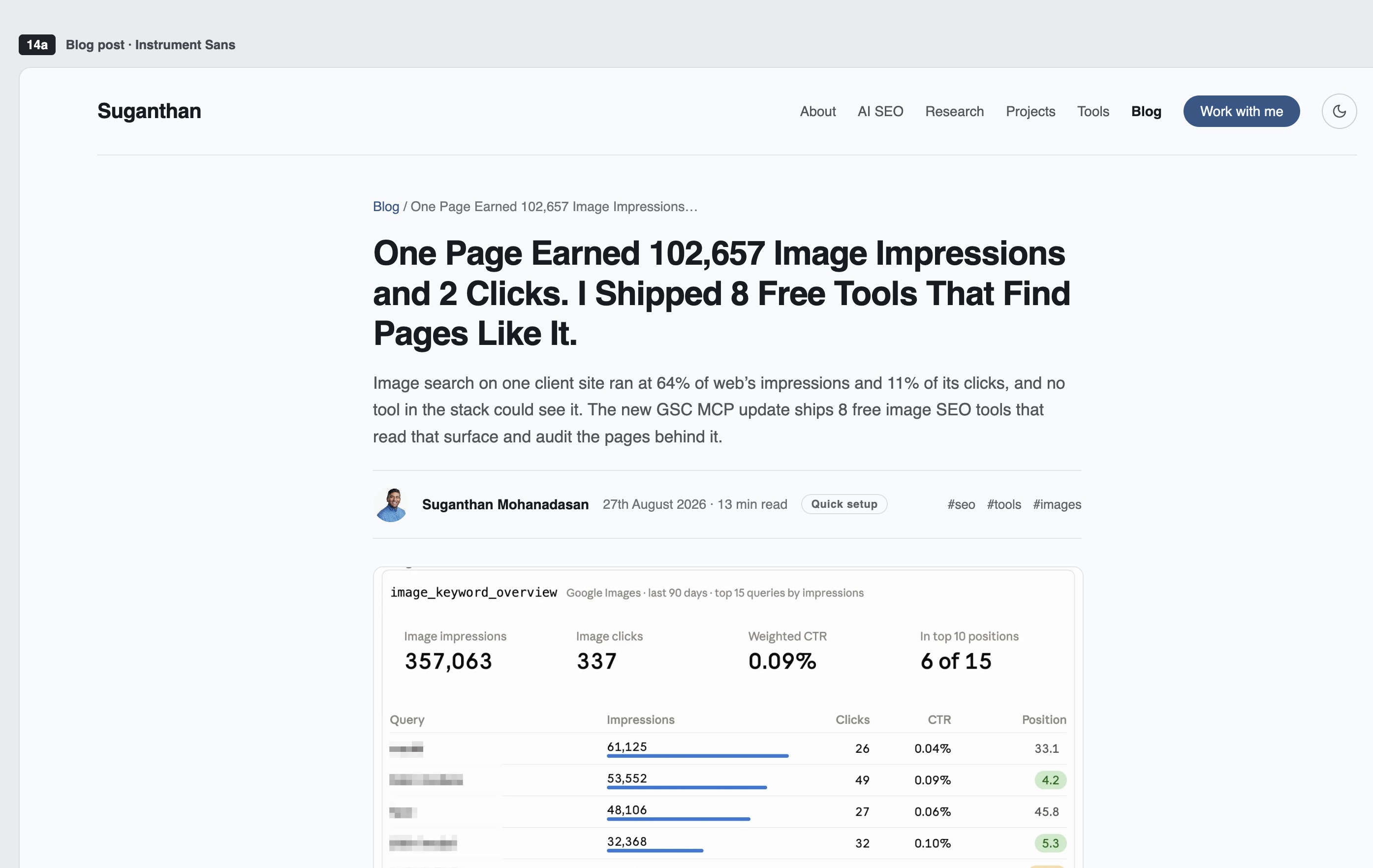
The last pass was a styling audit with impeccable.style, a design plugin for coding agents. Thanks to Mike Sonders for the recommendation.
It found one real fault, the progress bar animating the wrong CSS property, now fixed.
Hope you like the new design. ^_^